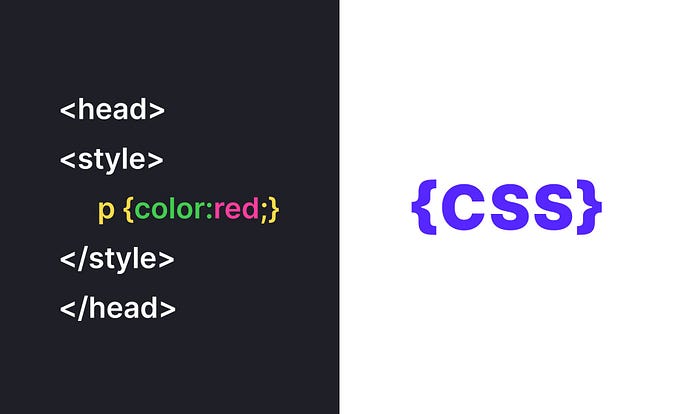
Responsive Typography Techniques with CSS
In today’s digital age, where users access websites and applications on a multitude of devices with varying screen sizes, ensuring that typography remains legible and aesthetically pleasing across all platforms is paramount. Responsive typography techniques with CSS offer a solution to this challenge, allowing text to adapt fluidly to different screen dimensions. In this article, we’ll explore several CSS techniques to make your typography responsive, ensuring that your text looks great on screens of all sizes.
1. Fluid Typography with vw Units
One of the most effective methods for achieving responsive typography is by using viewport width (vw) units. With vw, you can specify font sizes relative to the width of the viewport, ensuring that text scales proportionally as the screen size changes. For example:
h1 {
    font-size: 5vw;
}

p {
    font-size: 2vw;
}
In the above code snippet, the font sizes for h1 and p elements are set relative to the viewport width, ensuring that they adjust dynamically based on the screen size.
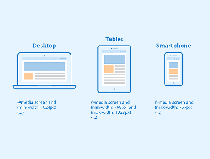
2. Media Queries for Breakpoints
Media queries allow you to apply different styles based on the characteristics of the device, such as screen width. By defining breakpoints and adjusting typography accordingly, you can optimize readability across various devices. For instance:
@media screen and (max-width: 768px) {
    h1 {
        font-size: 3.5vw;
    }
    p {
        font-size: 1.5vw;
    }
}
In this example, when the screen width is 768 pixels or less, the font sizes for h1 and p elements are adjusted to maintain readability on smaller screens.
3. Fluid Typography Using calc() Function
The calc() function in CSS enables you to perform calculations to determine font sizes dynamically. This technique is particularly useful when combining fixed and fluid values. Here's an illustration:
p {
    font-size: calc(16px + 0.5vw);
}
In the above code, the font size for p elements is determined by adding 0.5 viewport width to a base font size of 16 pixels, resulting in fluid typography that adjusts smoothly across different screen sizes.
4. Modular Scale for Harmonious Typography
Applying a modular scale to typography involves establishing a consistent ratio between font sizes, leading to harmonious and visually appealing text. CSS preprocessors like Sass offer tools for implementing modular scales seamlessly. Here’s a simplified example:
$base-font-size: 16px;
$scale-ratio: 1.2;

h1 {
    font-size: $base-font-size * $scale-ratio * $scale-ratio;
}

p {
    font-size: $base-font-size * $scale-ratio;
}
In this scenario, the font sizes for h1 and p elements adhere to a modular scale defined by the $scale-ratio, resulting in balanced typography across different sections of your website or application.
In conclusion, by leveraging CSS techniques such as viewport units, media queries, calc() function, and modular scales, you can create responsive typography that enhances user experience across a variety of devices. Experiment with these techniques to find the optimal balance between readability and aesthetics for your projects.
5. Fluid Line Length for Improved Readability
In addition to adjusting font sizes, it’s essential to consider the line length of your text for optimal readability. As the viewport changes, the width of text containers may vary, affecting the number of characters per line. To maintain readability, you can set the maximum width of text containers using responsive CSS techniques. For example:
.container {
    max-width: 800px;
    width: 90%;
    margin: 0 auto;
}
By setting a maximum width for text containers and ensuring they adapt fluidly to different screen sizes, you can prevent lines of text from becoming excessively long or short, thereby enhancing readability across devices.
6. Fluid Typography with em and rem Units
Using relative units such as em and rem for typography provides flexibility and scalability across various screen sizes and device settings. While em units are relative to the font size of the parent element, rem units are relative to the root (html) element. Consider the following example:
body {
    font-size: 16px; /* Define base font size */
}

h1 {
    font-size: 2rem; /* Two times the base font size */
}

p {
    font-size: 1.2em; /* 1.2 times the font size of the parent element */
}
By using relative units like em and rem, you establish a flexible typographic system that adapts smoothly to changes in font size preferences and viewport dimensions.
Convenient hosting for your WordPress sites
Looking for good hosting for your WordPress sites? Pay attention to Host4Biz. It is a reliable hosting with modern servers in Europe and a Ukrainian team.
And with the promo code MYHOST10 you will get a 10% discount on your first payment. To do this, register here and enter the code before paying.
Another great option for WordPress hosting is Hostinger. Register your account via the link https://hostinger.com.ua?REFERRALCODE=1VOLODYMYR55 and follow updates in my blog
Conclusion
Incorporating responsive typography techniques with CSS is essential for ensuring that text remains legible and visually appealing across a wide range of devices and screen sizes. By leveraging viewport units, media queries, fluid calculations, modular scales, and relative units, you can create a cohesive typographic experience that enhances user engagement and readability.
As you implement these techniques in your projects, remember to prioritize user experience and accessibility by testing typography across various devices and adjusting styles as needed. With a thoughtful approach to responsive typography, you can create engaging and accessible content that resonates with your audience across the digital landscape.
